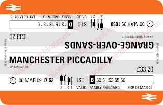
 So here it is. After complaining about the incredibly poor ticket design which UK train travellers (and staff) have to put up with, here is a re-imagining of it. Taking the original orange-and-white format as a starting point, there are a number of key features which should improve the ticket in use.
Importantly, the destination is the most prominent information, enabling people to see at a glance where the ticket is valid for. Underneath is the permitted route. In this case, the ticket is a return for two adults, one full-price child, and one concession child, and incorporates a seat reservation (coach and seat numbers). Using the inspiration of the timeless British Rail logo, the ticket is reversible depending on whether it is to be used for the outbound or return journey. The orange bands remain the location for the punchhole check by the guard.
The departure time and date are also shown, with an analogue clock to help make the time more memorable. In this way, all of the information on the current ticket design is preserved, reorganised into a user-friendly format, and anything distracting discarded or diminished.


No comments:
Post a Comment